A NEW STANDARD FOR MOBILE MONEY PAYMENTS
Hover gives developers the ability to integrate any mobile operator or service provider transaction that uses USSD((Unstructured Supplementary Service Data) into a native Android application by navigating existing USSD menus on user’s behalf.
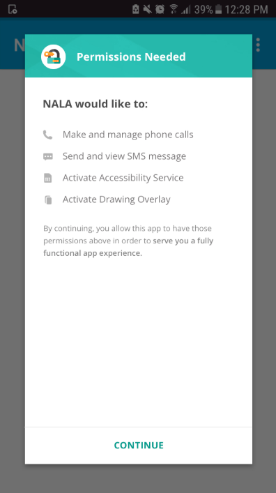
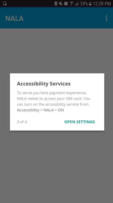
In order to do that, it requires several permissions. This is a problem because it can cause users to become confused and drop off.
Hover needs to determine the best practice for permission UX and make it easy for developers to implement it in their app and also needs to provide world-class designs for their end users.
To comply with my non-disclosure agreement, I have omitted and obfuscated some confidential information in this case study.
MY ROLE
As a freelance lead UX designer for Hover, I led efforts in user research, prototyping, usability tests and aligning stakeholders. The team included software developers, data analysts and marketing lead . The engagement of this project was 3 months.
See below the video to see the final output.
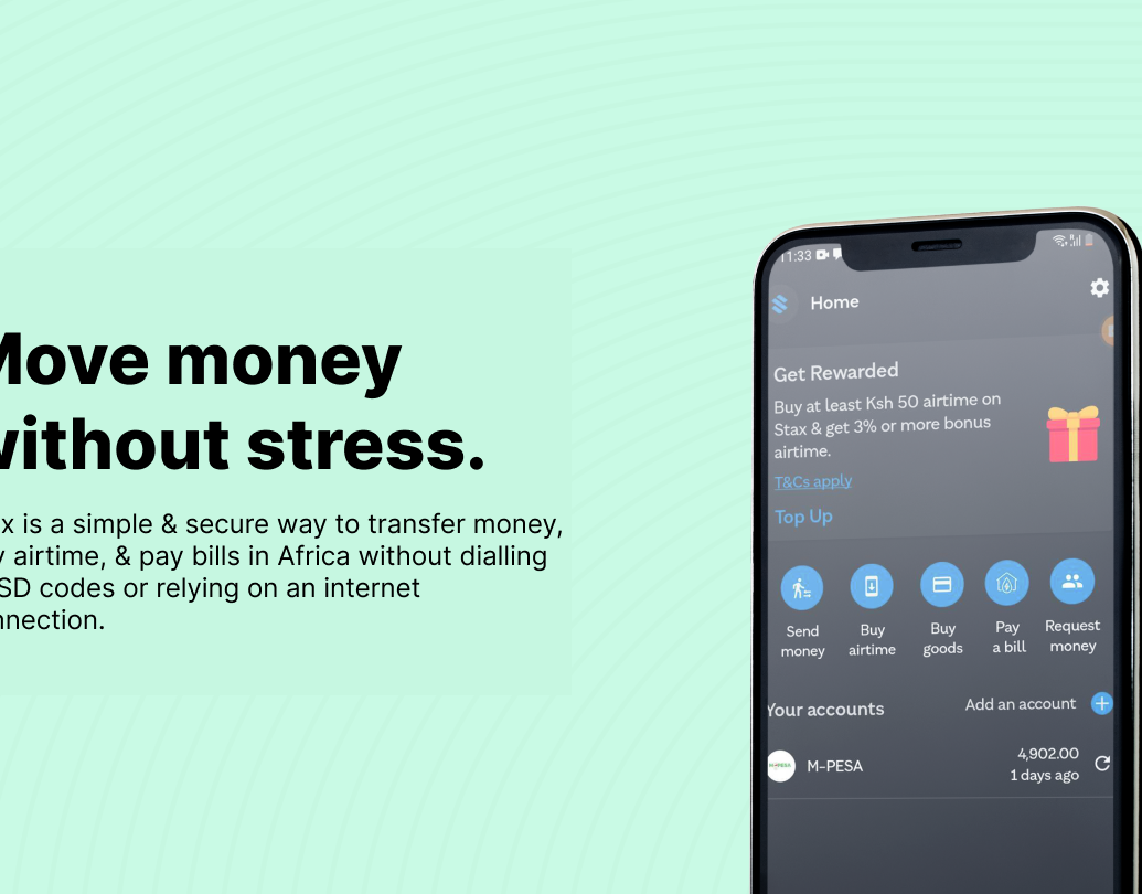
NALA app showcasing before and after implementing HOVER in their payments platform
GOAL
IMPROVE END USER ENGAGEMENT TO BOOST IN-APP MOBILE PAYMENTS
I was specifically brought in to help improve user permissions and payments experience. I worked closely with one of their clients NALA (a utility payments firm) who needed their payment platform be integrated with Hover to improve their fragmented USSD-based experience with a unified, rich user interface to increase use of mobile money more regularly.
DISCOVERY
Since the overall objective was to “create a baseline of [mobile money] usage prior to installing the app and then compare usage patterns with the app based wallet.”
I set out to the following subojectives to kick me off:
I set out to the following subojectives to kick me off:
1. Establish a baseline using actual data and SMS data by working closely with the data team,
2. Design the application UI and permissions flow to keep in mind customer centric principles,
3. Onboard, acquire and engage users to the app by improving the ui and permission flows, and
4. Describe usage and compare with same-user usage before the app was launched.
2. Design the application UI and permissions flow to keep in mind customer centric principles,
3. Onboard, acquire and engage users to the app by improving the ui and permission flows, and
4. Describe usage and compare with same-user usage before the app was launched.
1. Establishing a baseline data
Using a snowballing technique to source 3-month mobile money statements from 100 users, unfortunately we could only source this from telcos that had different ways of collecting data. We then standardized this mobile money statement data, which was later augmented by mobile money
transaction data parsed from participants’ SMS inboxes.
transaction data parsed from participants’ SMS inboxes.

Step 1. Establishing a baseline using actual data and SMS data
2. User research
We traveled to Tanzania, recruited 20 individuals from the baseline to participate in an in-person user experience research to establish baseline attitudes, behaviors, and observations in the context in which the app was to be used. I did prototype from the initial insights using Invision and adobe xd and engaged participants around several product iterations as incentives to help them convey their needs, expectations and ideas. Sessions lasted 80 minutes each.


Step 2: Contextual in-person user research and prototyping NALA utility payment and Hover permission flows
After synthesising the insights, I identified the following user archetypes as a result:
a) Zacharia “The Savvy Master” – Show me anything that can simplify the management of my SIM cards
b) Diana “The Entrepreneur” – I love products that make me efficient and effective
c) Milenge “The Comparator” – They are not going to sell me easily on services that involve my finances
d) Mary “The Safe User” – I want to make sure that nothing goes wrong!

3. Improve the UI and permission flows
Based on the prototype feedback, I explored some key design principles :

a) “Use Simple and Familiar Menu Terms” – I localized, simplified and visually-reinforced menu terms throughout Nala.

b) “Simplify Hover permissions flows” – Used a simulated permission that gave a better context for users, so they are prepared for what’s coming up next and know why they need to allow the permissions.


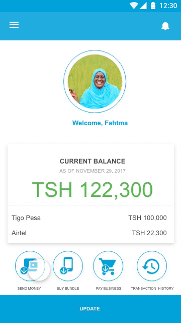
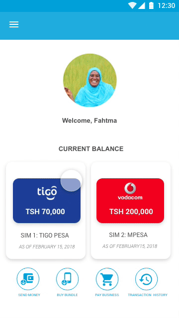
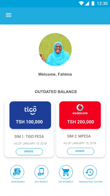
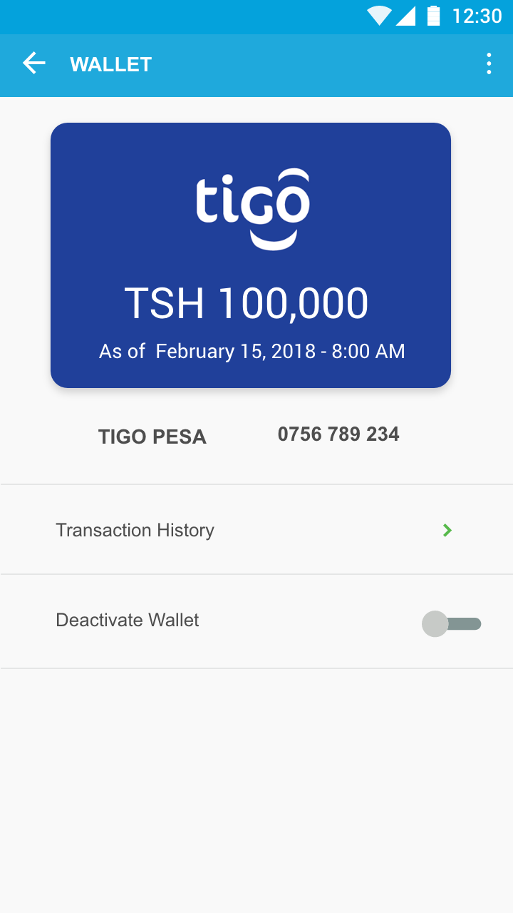
c) “Make Account Balance Easy to See and Hide” – I designed for users the ability to hide their mobile money account balance(s) to prevent screen 'spys' from seeing their sensitive information.

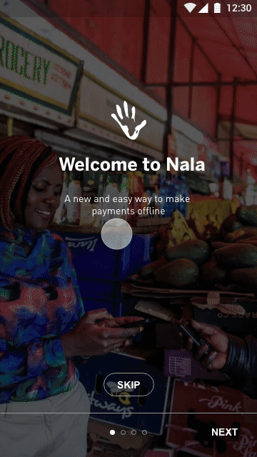
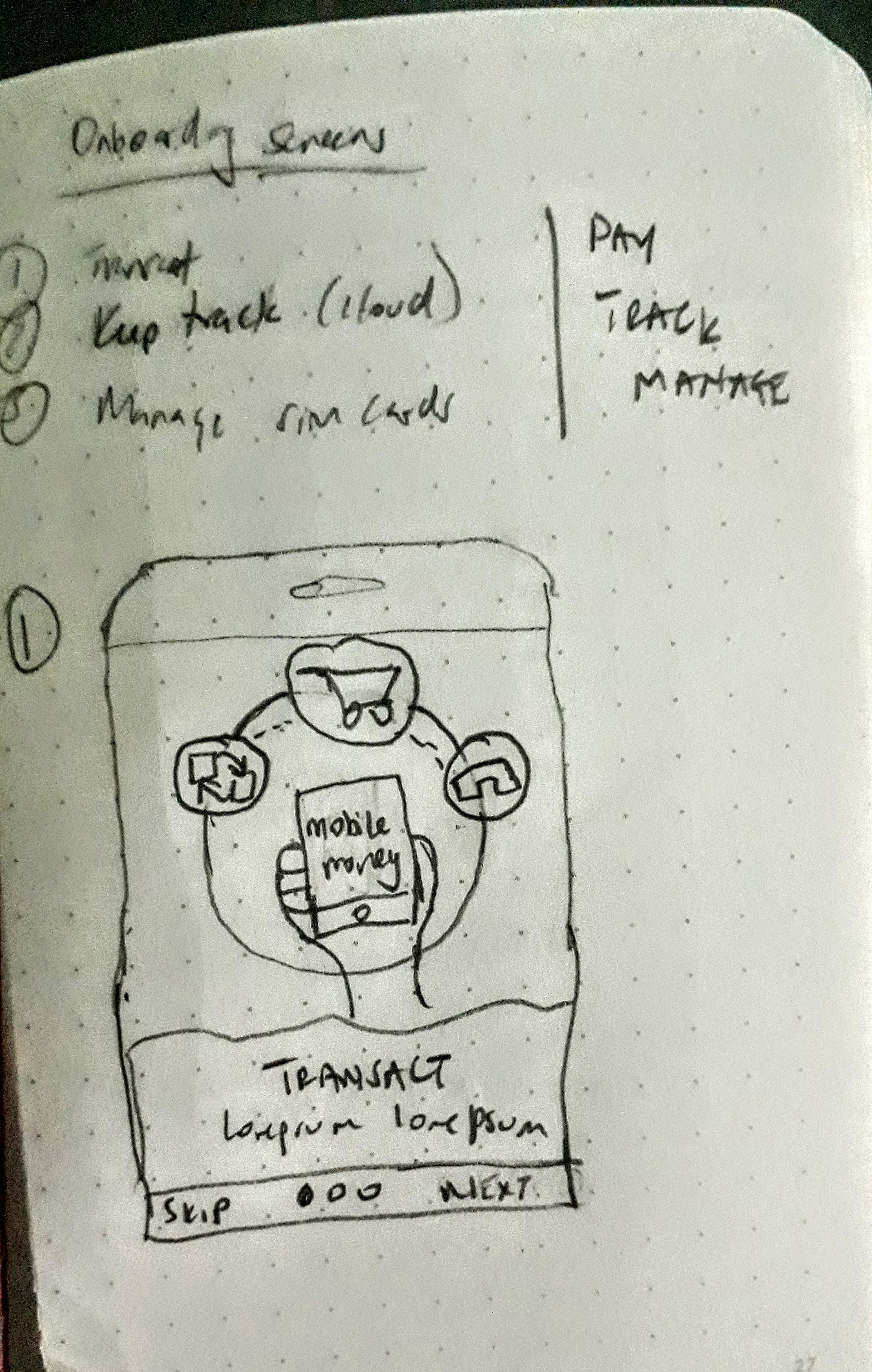
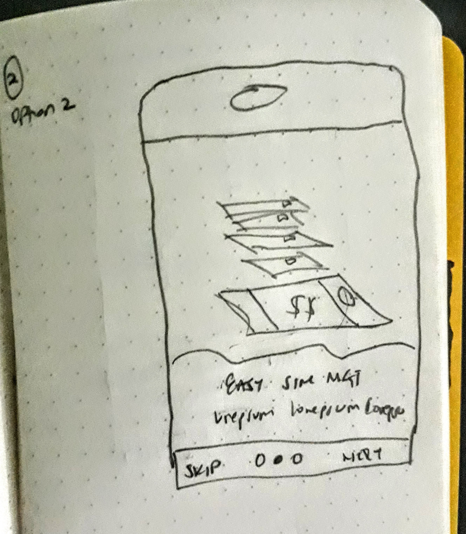
d) "Make the onboarding screens relate to the context" – I illustrated the onboarding screens to showcase NALA concept and communicate easily to the user the expected experiences within the app.
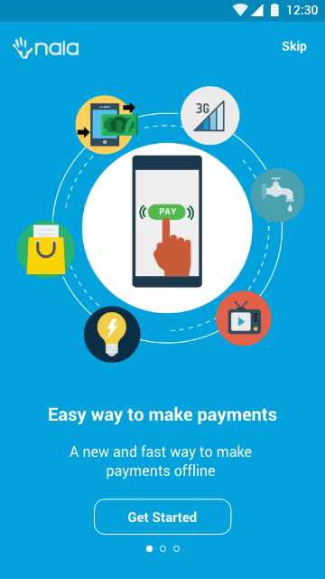
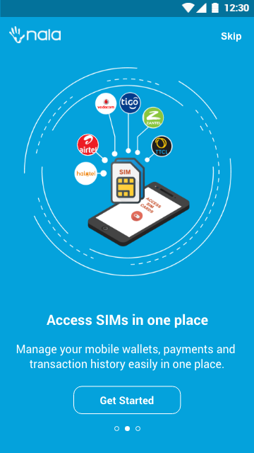
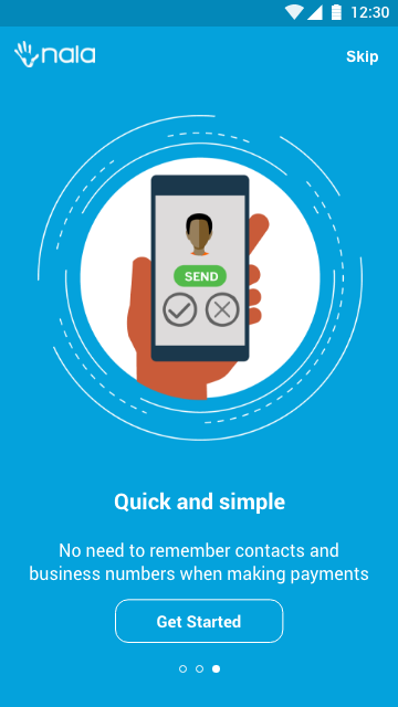
On-boarding screens for new users communicate the value proposition of the developers' (Hover's client)application
In-app payment screens (Hover client app)
4.Results/impact
The parties celebrated the following successes throughout the pilot:
1. 40,000+ Waitlist – At the time of writing, more than 40,000 Tanzanians had joined the NALA waitlist. For reference, the Tigo Pesa Android app in Tanzania has ~15,000 monthly active users.
2. 5.0 Star Rating on Google Play – NALA has 279 reviews and a 5.0-star rating on Google Play and was the #1 trending finance app in Tanzania for several weeks throughout the pilot period.
3. Adaptability – In several isolated cases, the hierarchy of USSD-based flows, syntax of SMS- or USSD-based confirmation messages, and biller account details changed, resulting in service interruptions and a negative user experience. That being the case, Hover was able to leverage
the over-the-top nature of its SDK to adapt to and fix these changes quickly – often in a matter of hours. Had Hover relied on application programming interfaces (APIs) from the mobile money providers, this turnaround time might have been impossible.
4. Device Compatibility – Given the nature of Hover’s SDK, there can be significant variance in transaction reliability from one device to another. Hover mitigated this risk by accommodating a broad range of handset makes and models throughout the pilot period.
5. Global 1 st – Nala is the first application in the world to implement Hover’s SDK in production. In turn, Nala represents the first time a mobile money provider’s user interface has been replaced by a 3rd party without the need for APIs.

Challenges
1. Dynamic Biller Details – Several utility providers such changed their mobile money pay bill details during the course of the pilot. Due to the nature of the Hover software development kit (SDK), any change in the underlying USSD menu or recipient account results in a failed transaction, which results in a poor user experience and a potential drop-off point.
2. Mobile Money Statements – Not every mobile money provider in Tanzania makes statements readily accessible to mobile money users, and some providers charge end users for access. Further, due to higher fees associated with accessing Vodacom M-Pesa statements, the quantitative data in this pilot is biased toward Tigo Pesa users.
2. Mobile Money Statements – Not every mobile money provider in Tanzania makes statements readily accessible to mobile money users, and some providers charge end users for access. Further, due to higher fees associated with accessing Vodacom M-Pesa statements, the quantitative data in this pilot is biased toward Tigo Pesa users.
3. Variable Promotions – Users buy airtime by buying bundles and special promotions, which can be time-boundand vary significantly within and between mobile money networks. Because of this, Hover struggled to maintain reliable Buy Bundles transactions, leading to reduced functionality and utility for the end user.