Perfecting the onboarding and features discovery for the Stax app redesign.
In 2018, transferring money anytime and anywhere without worrying about an internet connection felt magical. By the start of 2022, this magic receded to a slew of disparate features that made the experience complex to use.
As a Lead UX Design Consultant, I was part of an ambitious project redesigning the Stax experience.
To comply with my non-disclosure agreement, I have omitted and obfuscated confidential information in this case study. All information in this case study is my own and does not necessarily reflect the views of Stax.
DESIGN BY GROWTH
In just three years since its launch in 2018, Stax has quickly grown from a fintech app for individuals and small businesses in Africa to a leading payment platform. Stax now powers offline and online payments for thousands of customers in multiple African countries.
However, as Stax grew in popularity, it faced customer engagement and retention challenges. The app's user interface struggled to scale alongside the company's rapid integration with payment APIs. The app's features and experiments competed for attention, confusing users. App reliability and performance issues increased, impacting the overall user experience.
The Stax app had become disorganized, hindering its ability to serve its customers effectively.
the challenge
Our goal for the Stax redesign project was to recapture the app's initial success and improve customer engagement. While the original premise of Stax - powering offline and online payments - was simple, the app's design had become cluttered and confusing.
We aimed to create a more intuitive and user-friendly design to serve Stax's rapidly expanding customer base better. Our high-level goals for the project were:
1. Make it fast and easy for customers to use the app,
2. Give customers more control over their payments and financial management,
3. Create a platform for innovation and deeper engagement, enabling Stax to continue to grow and evolve alongside its customers' needs.
my role
As the design lead consultant for the Stax redesign project, I led the overall redesign of the onboarding experience, feature discovery, and transaction experience from Jan 2022 to May 2022.
Throughout the project, I worked closely with a team consisting of a researcher, software developers, content strategists, a growth lead, and a product manager to ensure that the redesigned app met the needs of Stax's customers and achieved our high-level goals.
Although I stepped away from the project as the app began to be built, I remained engaged with the team to ensure a smooth handoff and transition to the development phase.
The redesigned Stax app launched globally in September 2022.
kickoff
At the beginning of the Stax redesign project, we didn't have a clear mission or specific goals for improving the Stax experience. I collaborated closely with our researcher to gain insights and a deeper understanding of our customers' needs.
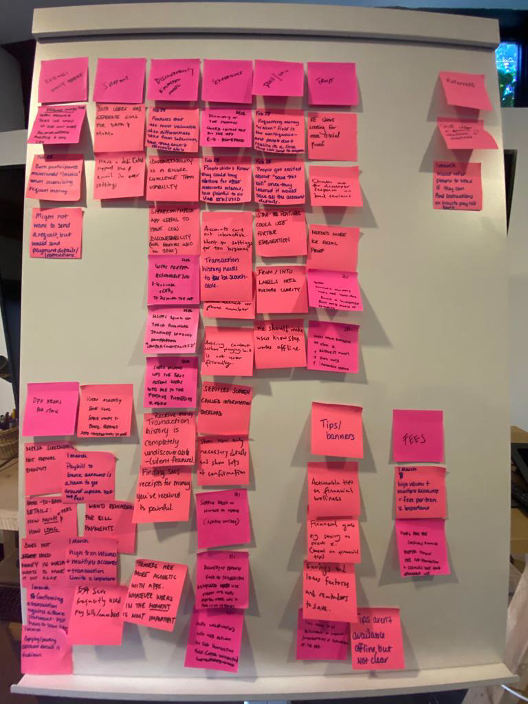
Together, we conducted extensive research to explore how Stax's customers were using the app and what pain points they were experiencing. Through interviews, surveys, and usability tests, we gathered valuable insights that informed our design decisions and helped us create a more user-centered Stax onboarding and feature discovery experience.
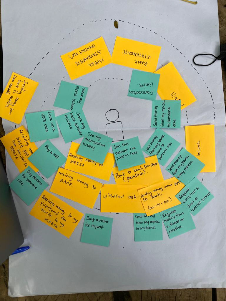
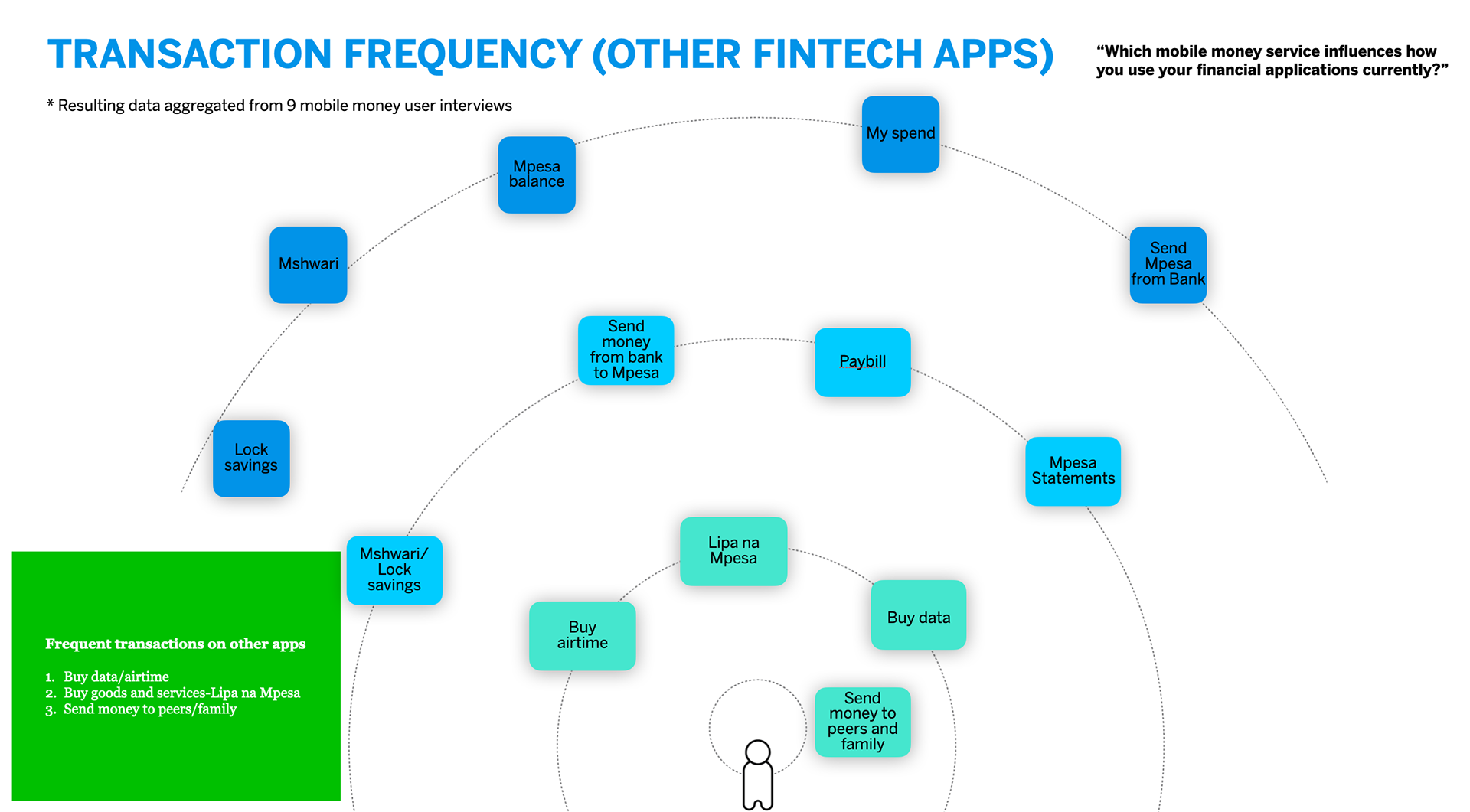
Understanding how Stax users use other fintech apps
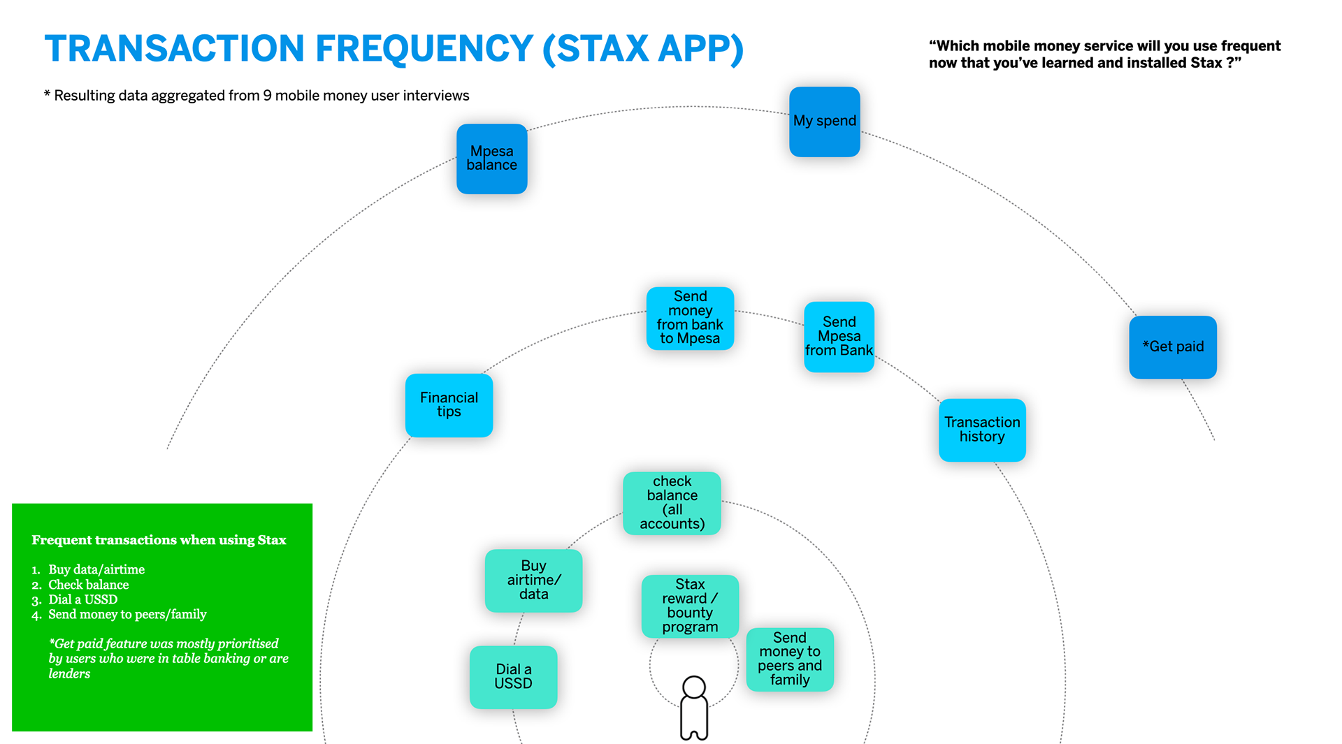
Understanding how Stax users use current Stax app
Early Insights from the Field
We conducted field research with 9 participants in countries that experienced low app retention to gain insights into Stax's customers' experiences with the app.
Our objective was to understand the challenges that Stax's customers, both senders, and receivers, faced when using the app and the solutions they employed to overcome these challenges. This research enabled us to identify pain points and opportunities for improvement that informed the redesign of the app's experience.
THE DISCOVERY
ARCHETYPES
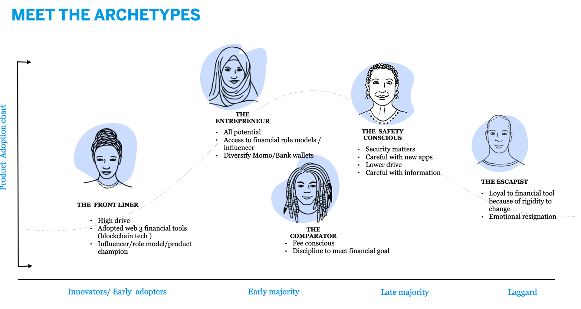
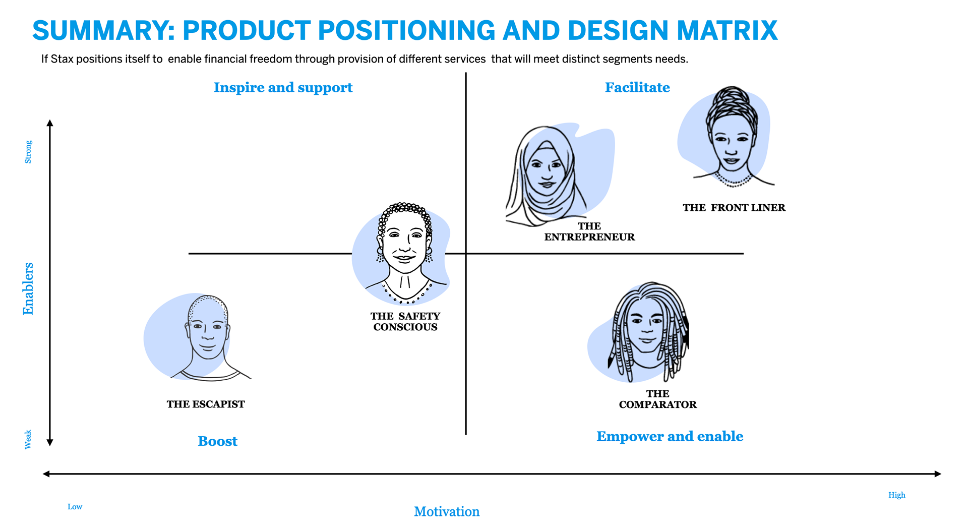
HOW WE GOT THERE
Three primary questions informed my design strategy:
1. How do you design for everyone, everywhere?
2. What contexts need to be considered?
3. What’s the perfect transaction experience?
Early on, it was important to understand the different factors that may influence the users' experience. I mapped all the possible concepts and translated this into the opportunity areas framework. This framing destroyed the team's stereotypes about users and marketplaces. The goal was to create design solutions that scale and extend to any combination of these contexts from the outset.
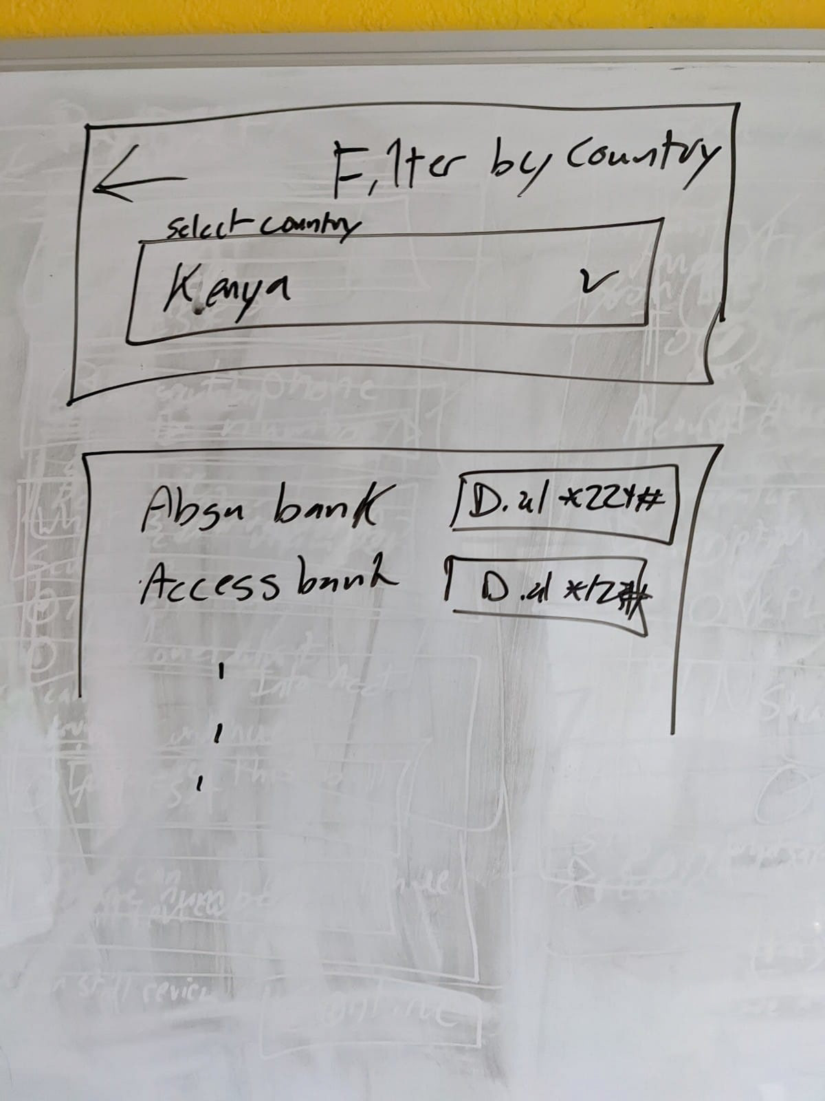
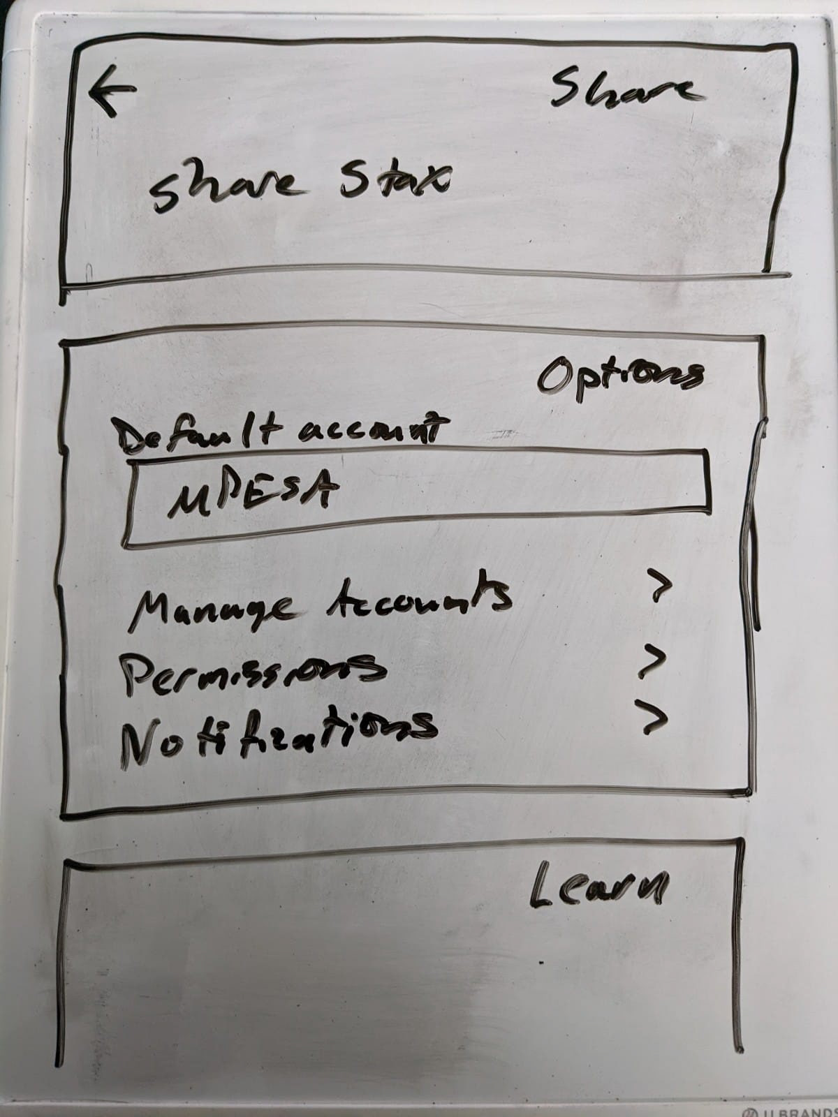
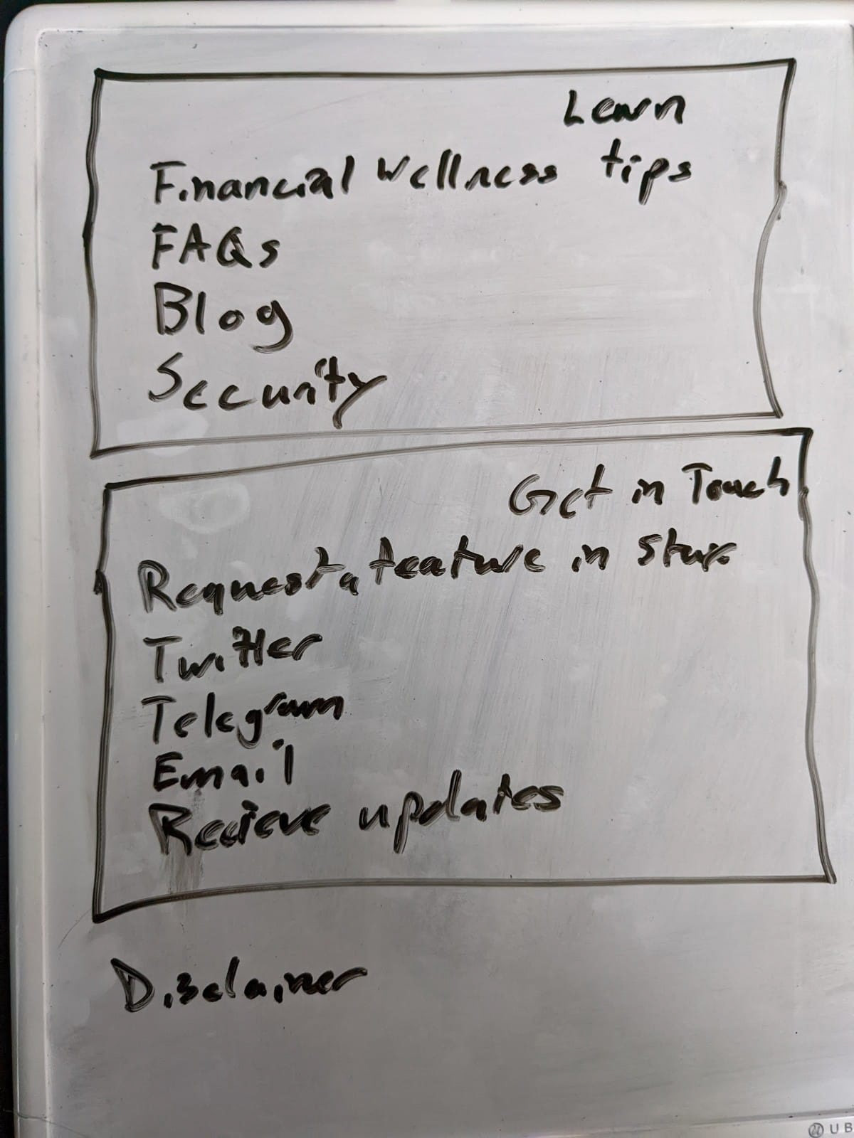
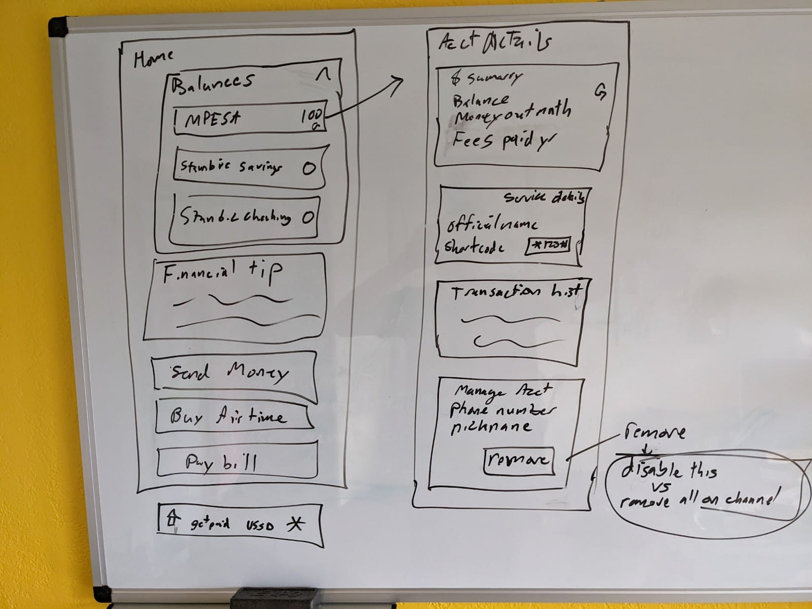
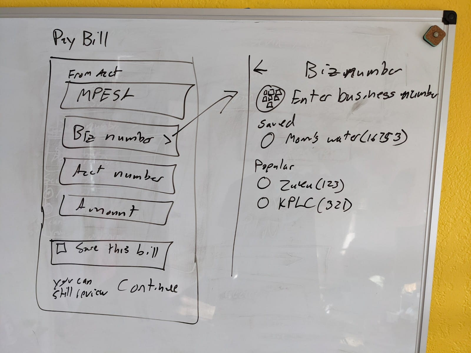
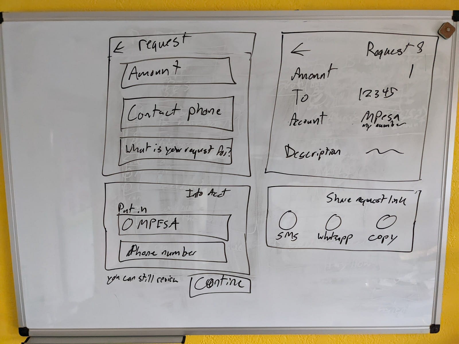
Early sketches of the adaptation framework.
THE REDESIGN
Onboarding - Getting started with tasks
1. Simplify the onboarding process: Breaking down the onboarding into smaller, bite-sized tasks to make it easier for users to follow. This would help users understand the different stages of the onboarding process and complete it faster.
2. Use conversational language: Using conversational language instead of technical jargon to make the onboarding process more user-friendly. This would help users understand the information provided and reduce confusion.
3. Provide guidance and support: To help users navigate the onboarding process, I suggested adding tooltips, hints, and examples where appropriate. This would give users more guidance and support and reduce their need to contact customer support.
Home page/Dashboard (Alternate path - pre &post task completion)
1. Simplify the navigation: I recommended simplifying the navigation by reducing the number of menu items and organizing them into logical groups. This would make it easier for users to find the necessary information and features.
2. Create a user-centered design: I proposed creating a user-centered design that focused on users' needs. This would involve designing the platform with a clear information hierarchy, using conversational language, and providing useful guidance and support where necessary.
3. Streamline the user experience: To make the user experience more streamlined and intuitive, I suggested removing unnecessary steps and reducing the number of clicks required to complete tasks.
Send money experience
Impact
The redesigned Staxapp resulted in a significant improvement in user engagement and satisfaction. The app was easier to navigate, and users could find the information and features they needed more quickly. The simplified navigation menu and improved information architecture contributed to a more intuitive and user-friendly design.
1. The redesigned app resulted in a 70% increase in user engagement.
2. User satisfaction increased by 30%, with users reporting that the app was easier to use and navigate.
3. The number of support tickets related to app navigation and usability decreased by 40%, indicating that the new design was more intuitive and easier to use.
For confidentiality reasons, I have omitted the actual values for these metrics.
The new design also had a positive impact on the app's usability. User testing showed that customers could complete transactions more quickly and efficiently with the new design. Accessibility testing also showed that individuals with different levels of technological literacy could use the redesign.
Conclusion
In conclusion, Stax's redesign succeeded in improving customer engagement. By creating a design that was more intuitive and user-friendly, we were able to increase customer engagement and retention. The positive feedback from customers underscores the importance of human-centered design in fintech app development, and the improved engagement and retention numbers highlight the effectiveness of the redesign. However, customers still leverage direct telco manual entry USSD services instead of using the simplified Stax experience. I believe this to be a behavior change that will be revealed over a longer period of time.
